How to Build Power BI Dashboards That Actually Help You Make Decisions
Your accountant sends over a spreadsheet. Your practice management software has a reporting tab nobody opens. Your bookkeeper exports a monthly summary that lands in your inbox and sits there. Somewhere in all of that data is the information you need to run your business well - but getting to it takes longer than it should, and half the time the picture is still incomplete.
That is the problem Microsoft Power BI is designed to solve. It connects your different data sources into a single dashboard, so instead of switching between systems and trying to reconcile numbers manually, you see everything in one place. It has over 500 connectors, meaning it can pull from tools like Xero, Salesforce, Excel, and many others your business might already be using. The result is reporting that reflects your whole business, not just one slice of it.
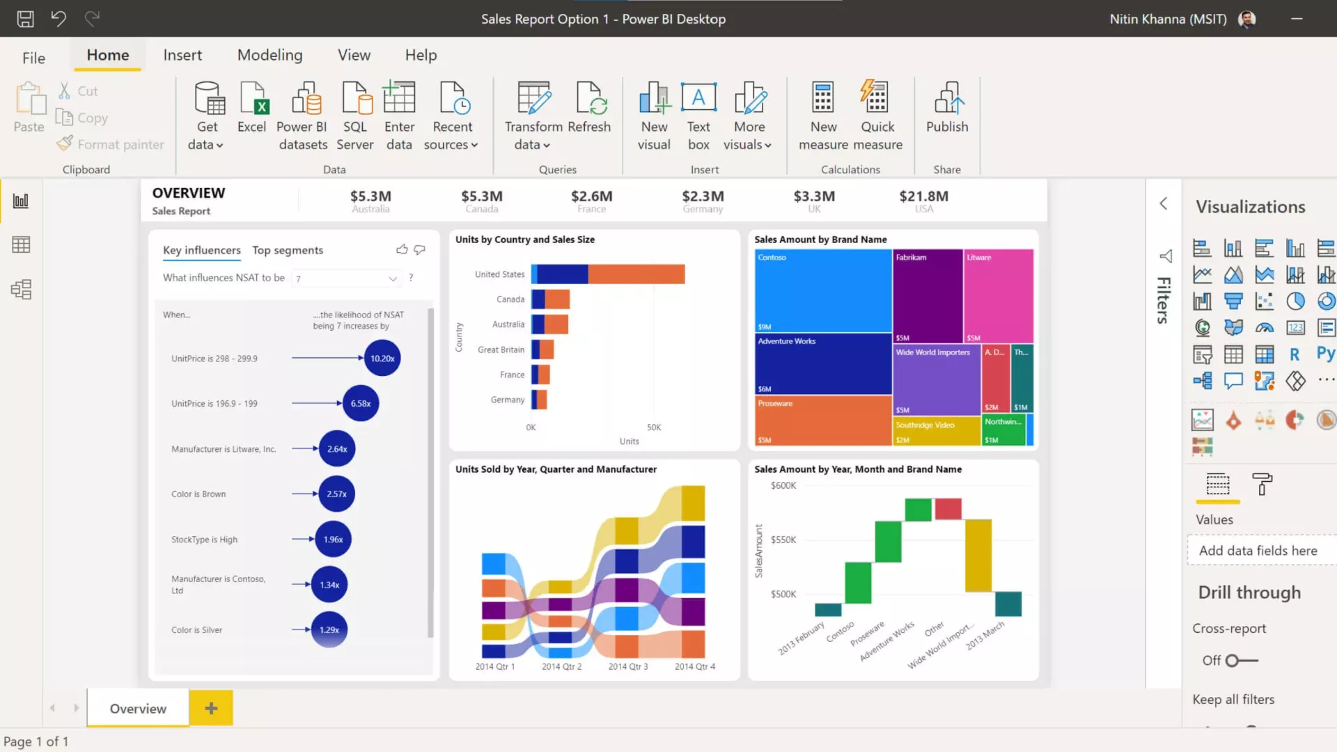
The software itself is only part of the equation, though. A dashboard full of charts is not automatically useful. Done poorly, it can actually mislead - pointing people toward the wrong conclusions because it shows data without context. The goal is a dashboard that answers the question your business owner or practice manager actually woke up thinking about, without requiring them to interpret a wall of graphs first.
Good dashboards are built with the reader in mind, not the data. Before adding any chart, the question worth asking is: what decision does this person need to make, and what would help them make it faster? That shapes everything - which data gets included, how it gets displayed, and how much context sits alongside it. A short label or tooltip explaining what a chart shows can save someone ten minutes of confusion and get them to a decision in thirty seconds instead.
Simplicity matters more than completeness. A crowded dashboard is harder to read than a focused one. Keeping only the most important information visible without scrolling, using clear colour signals for things like performance thresholds, and placing the most critical chart in the top-left where the eye naturally lands - these small choices make a significant difference to how useful the dashboard actually is. Power BI also includes a tool called Power Query that handles a lot of the behind-the-scenes data preparation, which saves time when building and maintaining reports. Businesses that have already looked at practical technology upgrades for professional services firms will recognise this kind of incremental improvement.
Most professional services businesses have more useful data than they are currently using. The gap is usually not access to data - it is having it connected and presented in a way that supports faster, better-informed decisions. That is where a well-configured Power BI setup earns its keep. Poor underlying infrastructure can undermine even the best reporting setup, so it is worth understanding what IT downtime is really costing your business before investing in tools built on top of it.
Setting this up properly is a one-time effort that pays off every month. If you work with a managed IT provider who understands Microsoft 365, they can handle the configuration and make sure your data sources are connected correctly from the start. If you are currently wondering whether your provider is the right fit, it helps to know what switching IT providers in Christchurch actually involves. You can learn more about how ITstuffed supports professional services businesses with Microsoft 365 and related tools at /it-support-professional-services.
If you want to understand whether your current IT setup is getting the most out of the tools you are already paying for, ITstuffed offers a free 15-minute IT Fit Check. Book one here.